Digital Document Submission
OVERVIEW
In 2016, SunLife introduced a feature in the app that allowed users to send their documents digitally. As with any digital channel, it was very popular and resulted in a lot of documents being sent in. Among the documents being sent, there were a lot of incorrect and misdirected documents. This resulted in additional effort for the back-end staff, as they had to manually send these documents to the right business unit/team. Overall, this was costing the company money, using employees’ time and resources for tasks that should have been improved with the addition of this feature while also creating a bad experience for users looking to close their claims.

BEFORE - version of the feature with multiple buckets
MY ROLE
As the lead UX designer on this project. I was initially, tasked with
understanding why users were sending documents in the wrong buckets
why were they sending the wrong information
future proofing the document submission flow
APPROACH
One of the first tasks was to understand how our users were using the current document submission flow.

The card sorting results clearly showed that without a bucket for Insurance, people were trying to send insurance related documents in the wrong buckets. The investment and benefits related documents were heading in the right direction.
CARD SORTING
In order to really understand the information architecture of this problem, a card sort was initiated. Our users were asked to categorize different documents regarding three of SunLife’s basic buckets. The results showed that because we had multiple buckets (see above). Our users were confused about exactly what to send especially regarding their insurance product, e.g. Life insurance offered through your employer could be considered both a benefit and personal product when there was no insurance bucket.
Through this one of the first takeaways was to add a separate bucket for insurance
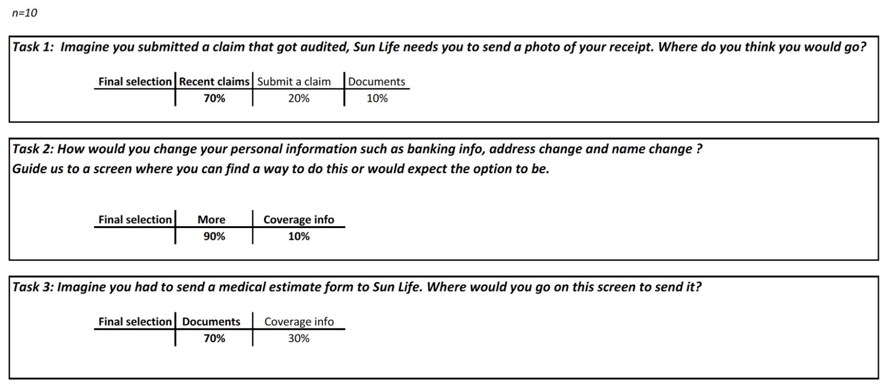
USER TESTING
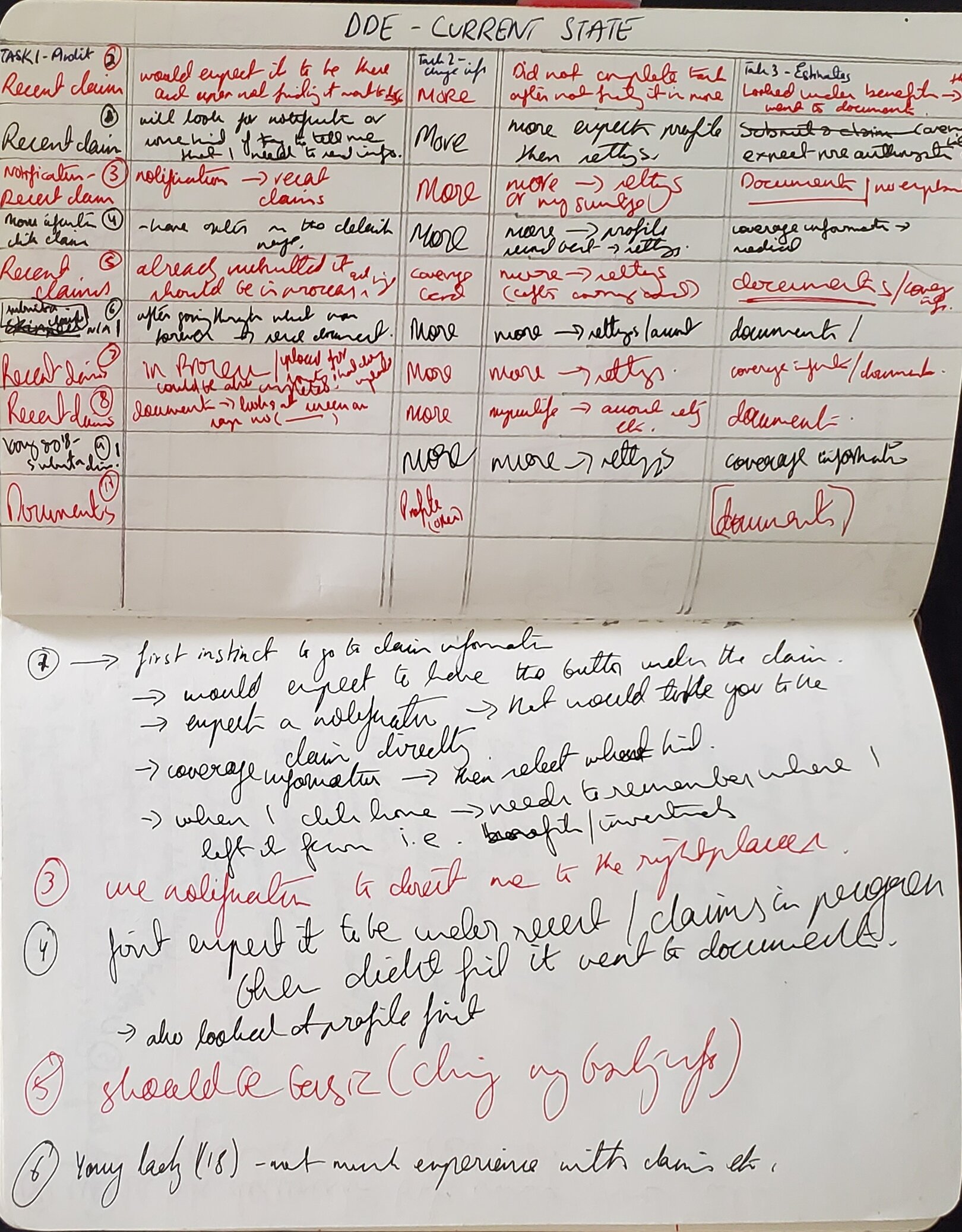
The next step was to see how users were sending us specific documents through the digital submission section of the app. 10 users were asked to do three tasks. Some key finding came forward including the fact that users were rightfully trying to send information regarding recent claims through the “recent claims” section. In the previous version of the app, this section did not have the option to do it.
Based on the initial research from various areas. There were a few improvements that were submitted to be added to the scope of the project. These changes were going to allow for a more robust user experience and also streamline the back office processes. A summary of some of those suggestions were:
Cleaning the experience from users perspective, so even if they start their journey from the wrong part of the app they can still finish sending their documents digitally
Adding more contextual cues to each bucket so users are not relying on calling in to the call centre for support
A major discovery was the addition of an hours of operations pop-up which surprisingly was missing
USER FLOWS
After all the work, a userflow was created that tackled with all the business requirements plus added all the UX recommendations. This was presented to the stakeholders to grab their feedback and explain how a more streamlined approach can create a better experience on both sides of the button.
The red boxes are all the new screens or points of interactions that did not exist before. With this flow the user was guided to the right section even if they accidentally started their journey from the wrong section of the app. In this case the “send documents”.
MORE USABILITY TESTING
After the flows were approved, another round of testing but now with the new screens was initiated. Users were asked to go through a prototype with high fidelity mockups. Since the target demographic at SunLife is so diverse. The solution needs to work at multiple levels of accessibility and intuition. This round of testing was done both through usertesting.com and gorilla testing in the office cafeteria. The intention was to gather diverse feedback from both veterans of the SunLife ecosystem and those who are new.
These new flows were received very well and users were handing out high marks in both ease of user (4.8/5) and likelihood of using this again (4.5/5).
RESULTS

Current state version of the app with most of the changes implemented that came out of the design journey
Overall, the implementation was a huge success.
Some key findings included
Decrease in call volumes by 60% in the first 3 months of implementation alone
Increase in digital document submissions through the app by 450%
Decrease in incorrect submissions by 50%
Cost savings to the call centre and back office over a $1M+